Prism Events
THE LOGO
Inspired by a prism glass that produces a spectrum of colors, the logo symbolizes Prism Events’ unique offering as a queer-led events company.
Spelled out in the typographic logo are the letters in an upward motion to show movement and progress plus, the nature of an events company that is always on the go.
THE BRAND COLOR
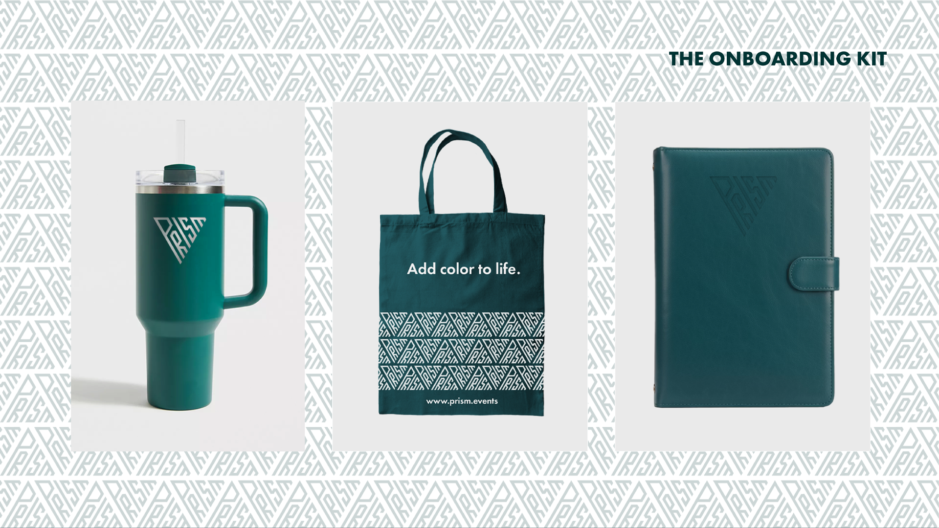
The brand color is a dark shade of teal. The teal color symbolizes tranquility and sophistication. It assures Prism’s clients that however busy, fast-paced and simultaneous activities are happening in an event, the Prism team remains focused, calm, organized and will deliver nothing but the best.
THE TYPOGRAPHY
The official typography used for the brand is Futura, a modern and clean font that has a big family of weights which can be used flexibly in various applications.
It has a combination of thick rounded letters for legibility and sharp corners that match the geometry of the logo.
Testimonial