
Roman Catholic Archdiocese of Manila
THE PROBLEM
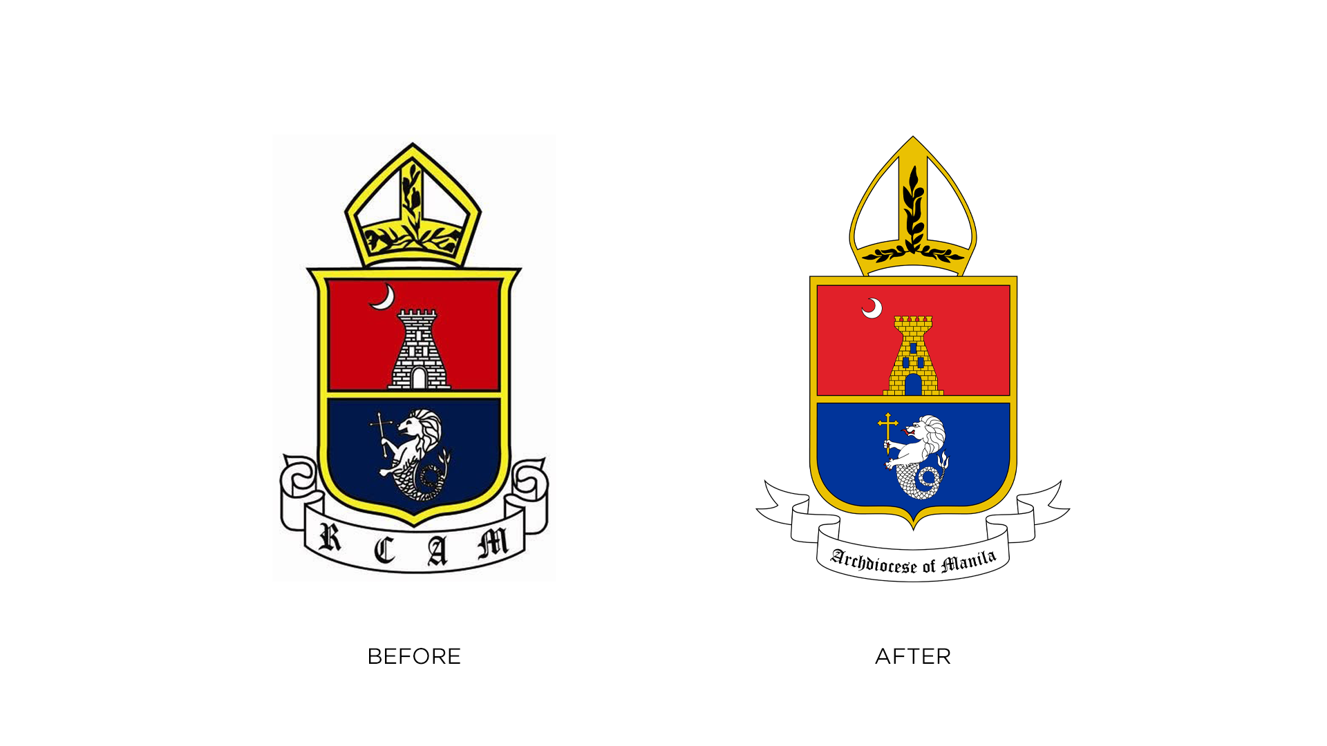
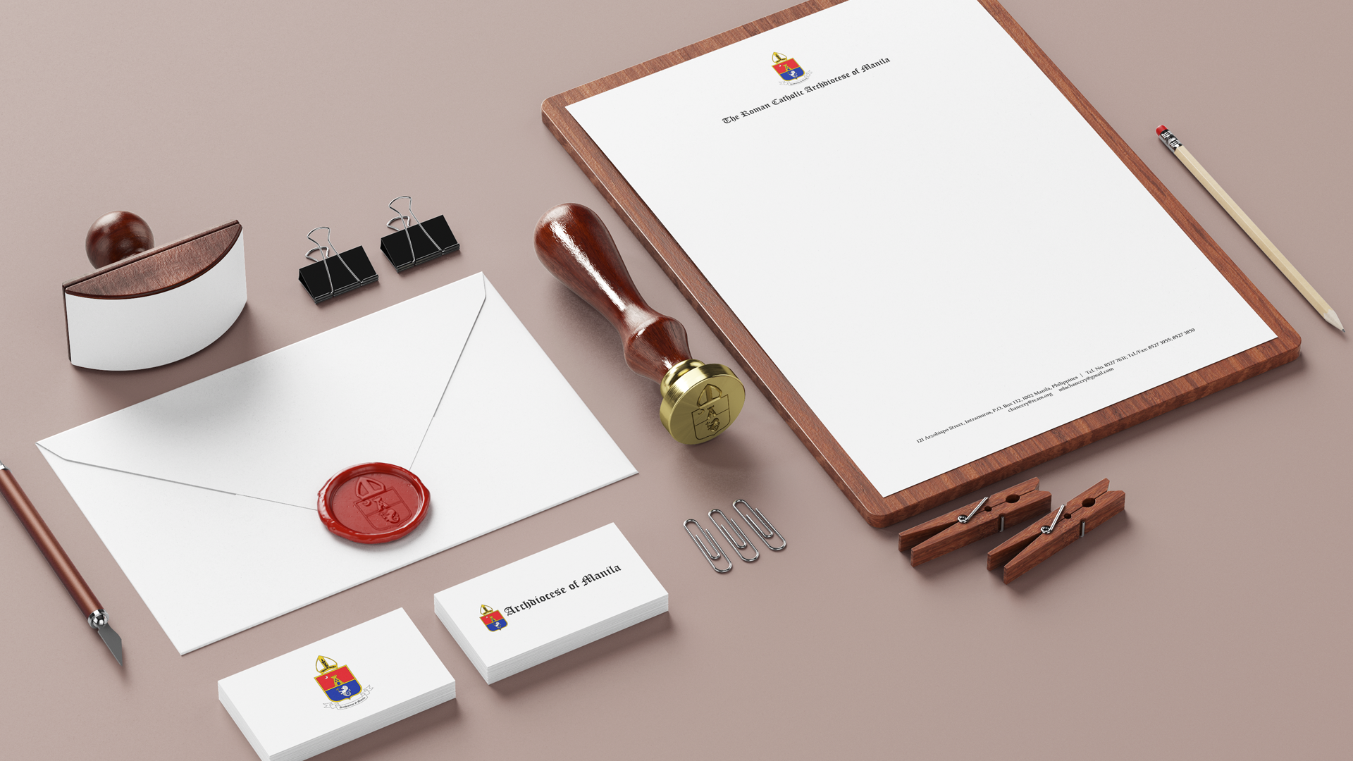
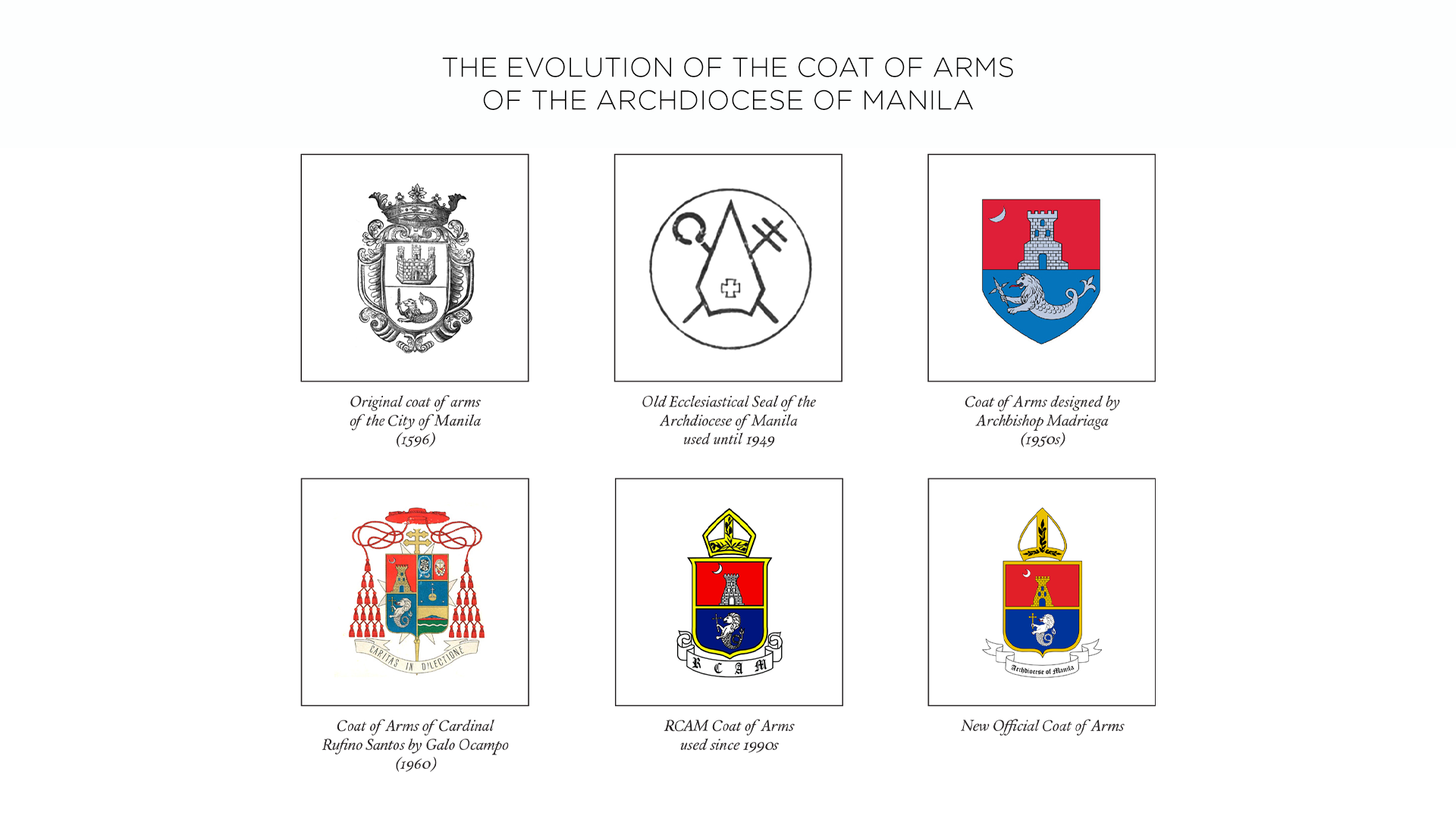
Since the 90s, the Roman Catholic Archdiocese of Manila has been using the same hand drawn-looking coat of arms. They needed a refresh of their identity with cleaner lines, high resolution graphics, and a modern take on a heraldic seal. Along with the modern coat of arms, they requested an updated official stationery and a style guide on how it will be used by different parishes and offices in the archdiocese.
THE SOLUTION
This redesign for the Roman Catholic Archdiocese of Manila keeps the heraldic meaning intact but trades the 90s hand-drawn look for a system that actually works today. It features mathematically clean curves and consistent stroke weights throughout. Every line looks intentional and it will scale to billboard or social media size without breaking down.
Colors now have better contrast especially on the elements inside the shield. The improvements in the color also helps with print consistency and digital accessibility. The rich gold tone replaces a lot of the blacks in the original but is also theologically significant, and also reads as more authoritative.
For typography, the “Archdiocese of Manila” is now written out fully in a cleaner blackletter font. The scroll is simplified with wider, more open curves. It spells out the name for clarity, which helps with public recognition across parishes and offices.
A portion of the brand manual below explains the different elements of the coat of arms:
The coat of arms identifies and represents an institution through symbols. The ecclesiastical arms of the Metropolitan See of Manila was designed by ecclesiastical heraldist Archbishop Mariano A. Madriaga, which was later drawn by Filipino artist and heraldist Galo B. Ocampo. It is an adaptation of the arms granted by His Catholic Majesty Philip II of Spain to the first capital of the country honored by the title La Muy Insigne y Siempre Leal Ciudad de Manila (The Noble and Ever Loyal City of Manila) on March 20, 1596.
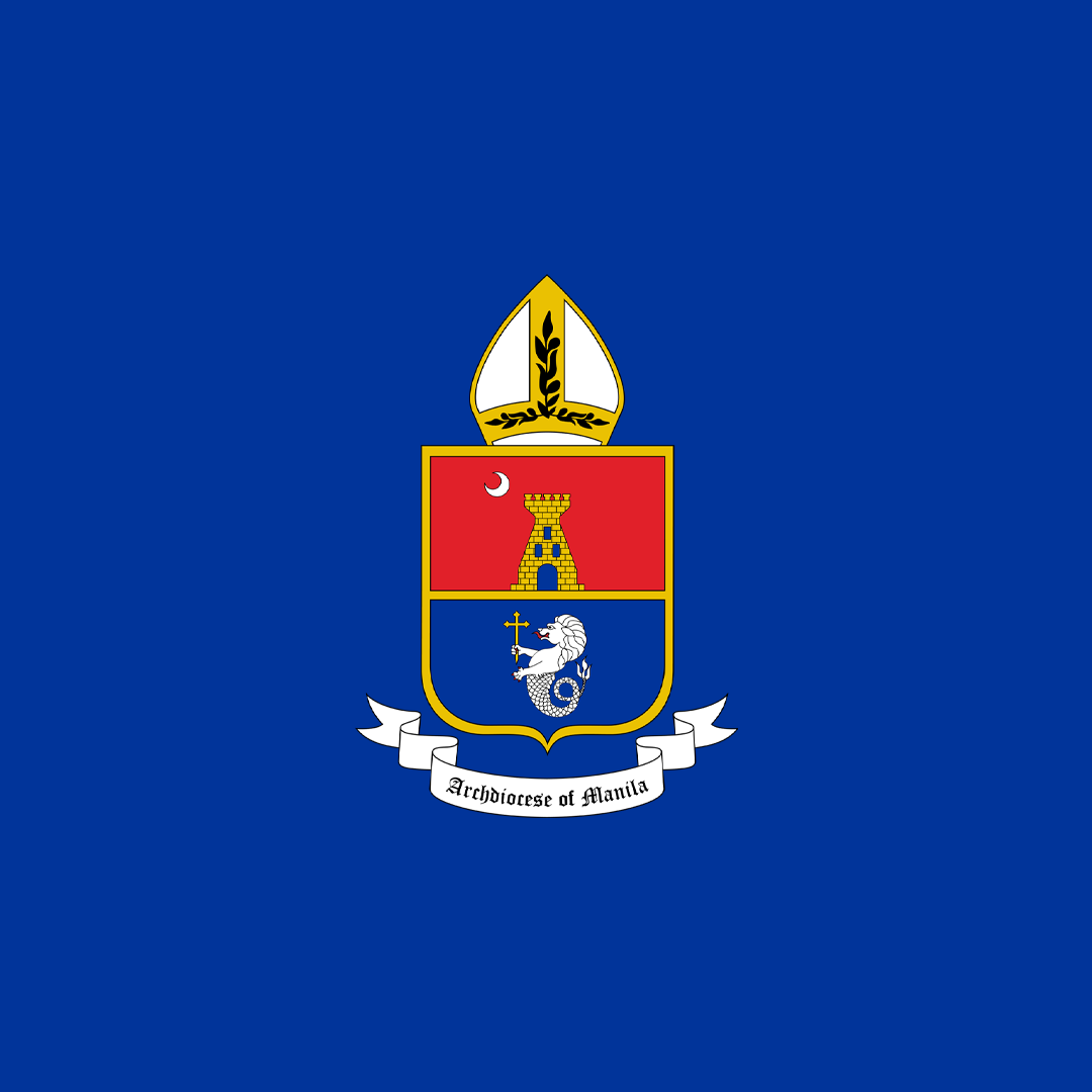
The arms of the Archdiocese of Manila consist of a shield divided horizontally into two fields, the upper gules (red) and the lower azure (blue). In the upper field against the red background is depicted a tower in gold with a door and three windows in blue, and a silver crescent on dexter chief. In the lower field against the blue background is a silver-colored sea lion holding in its right paw a cross fitchée.
The castle in the original arms of the City of Manila, which originated from the crest of the Kingdom of Castile, was changed into a tower to represent God Himself, who is called in Psalm 60:4 “turris fortis contra inimicum” (a tower of strength against the enemy). The three windows make the tower reflect the Blessed Trinity: Father, Son, and Holy Spirit, three Persons in one God.
The silver crescent placed in the upper right-hand corner of the shield represents the Immaculate Conception, patroness of the Manila Cathedral, the Archdiocese of Manila, and of the entire Philippines. The symbol of the moon comes from Revelation 12:1 – “A great sign appeared in the sky, a woman clothed with the sun, with the moon under her feet, and on her head a crown of twelve stars.”
The sea lion historically called the Ultramar (in Latin ultra means from beyond and mar connotes the sea) was a distinctive emblem given by the King of Spain to the City of Manila as an overseas colony. The lion is derived from the arms of the Kingdom of León, with a tail of a fish instead of legs to identify Manila as a territory overseas.
The sword held by the sea lion was substituted with a cross fitchée which is a cross whose base is pointed. Crosses of this description are said to have been carried by the early Christians on their pilgrimages so that they might readily be fixed in the ground while performing their devotions. This signifies the missionary call of the Filipino people to plant the faith, not only in Asia, but throughout the world.
Another reason for the substitution of the sword by the cross is the policy enshrined in the Constitution of the Philippine Republic: “The Philippines renounces war as an instrument of national policy, adopts the generally accepted principles of international law as part of the law of the land…” (Art. II, Sec. 2). By this, the Filipino faithful proclaim that they cannot “glory except in the cross of our Lord Jesus Christ” (Gal. 6:14).
Surmounting the shield is a miter, a symbol of rank and responsibility for prelates, representing the jurisdiction of the Archdiocese of Manila as a diocese established by the Pope and given to the care of our Archbishop. The miter is also a sign of our final victory in heaven, its symbolism arising from St. Paul’s analogy: “I have fought the good fight, I have finished the race, I have kept the faith. From now on the crown of righteousness awaits me “ (2 Tim. 4:7-8).
The newly redesigned coat of arms of The Roman Catholic Archdiocese of Manila respects canon law and tradition while solving real production problems. It moves RCAM from a single fragile illustration to a proper identity system that the archdiocese can actually use.
Testimonial