Tsaa Laya is set out to change how Filipinos see local herbal tea. Since teas in the Philippines were mostly viewed as traditional medicine, Tsaa Laya’s Premium Tea Collection challenged that idea by presenting Philippine herbs as stylish, premium, and part of everyday life. The packaging and identity designs by Agudo Designs were built to carry that mission. Every color, photo, and line in the logo was chosen to reframe local ingredients as world class while staying deeply rooted in Filipino culture and community.
The visual identity starts with the Tsaa Laya logo, which is rich in symbolism. The arc rising over the second A represents the sun, a nod to the Philippines as the Pearl of the Orient Seas and to the sun at the center of the Philippine flag. It signals national pride, new beginnings, and the daily ritual of a morning cup. Above the arc soars a Philippine Eagle, the country’s national bird since 1995. The eagle stands for freedom, which ties directly to the word “laya,” as well as magnificence, power, and success. It elevates the brand from folk remedy to something aspirational. The two A’s in “TSAA” are also intentional. They represent Mt. Kalisungan and Mt. Atimla, the twin mountains of Laguna that serve as the backdrop for Kapwa Greens in Calauan, where the teas are made. By building the community into the wordmark itself, the logo makes the social enterprise mission inseparable from the brand name.
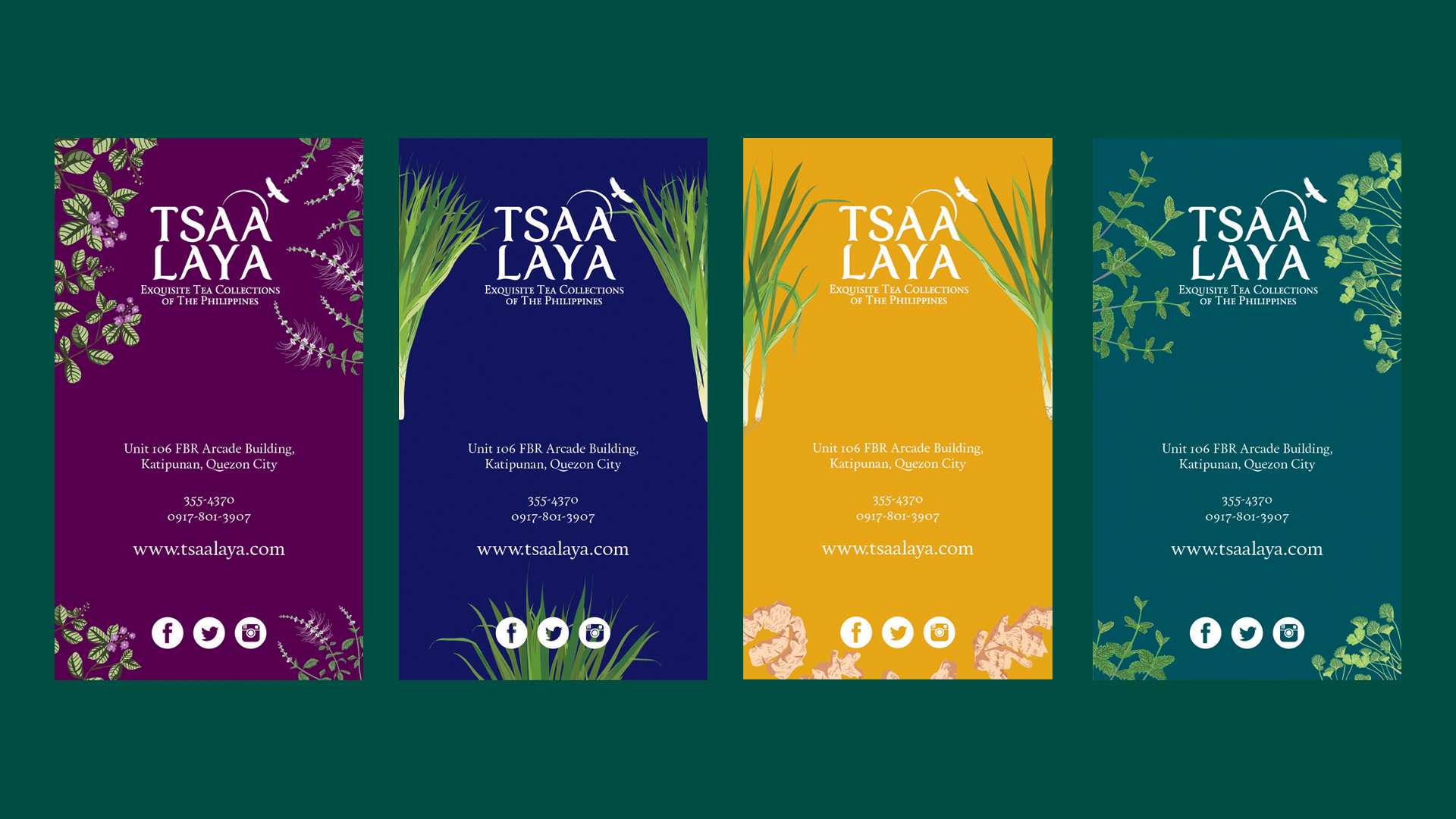
This symbolism extends into the packaging and banners. The system uses bold, botanical colors pulled from the ingredients themselves: deep teal for Centella Mint, royal purple for Java Banaba, sunny yellow for Lemon Ginger, navy for Tanglad, and olive green for Pandan. Each variant features clean botanical line illustrations of its main herb, giving the line a scientific yet modern look that avoids feeling clinical or medicinal. Even the collaterals keep the system consistent. The business cards use the same colors, botanicals, and logo lockup, making them feel collectible and modern.
Altogether, the Tsaa Laya design and brand identity were made by weaving story, place, and purpose into every visual choice. The logo embeds national symbols and the Calauan community into the name itself. The packaging uses color and illustrations to make local herbs feel fresh, premium, and coffee-shop ready. The system is cohesive across tins, pouches, banners, and cards, yet flexible enough for each flavor to stand out. This proves that Filipino craft could be both proudly local and globally stylish, turning tea from medicine into a daily act of freedom.