Island Bear Travels needed to stand out in Palawan’s crowded tour market. Coron and Puerto Princesa are full of operators using the same visual clichés: palm trees, sunsets, waves, and script fonts. Most brands blur together and feel generic.
The company also had a name challenge. “Island Bear” is memorable but confusing—there are no bears in Palawan. Without strong visuals, people might think it’s a typo, a foreign franchise, or not trust it as a local expert.
How do you build a local, trustworthy tour brand that feels adventurous and distinct, while making a non-native animal in the name feel intentional and ownable?
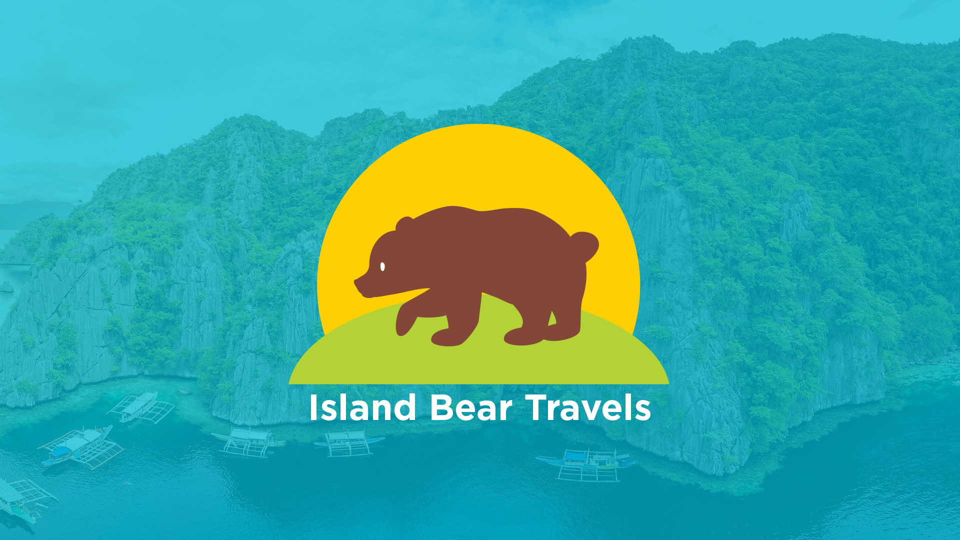
The logo has a clean, playful, and tropical vibe that fits Island Bear Travels really well. In the background is a solid bright cyan color that feels like the clear Palawan sea and sky. The icon is a flat, minimalist illustration stacked in three layers. The bold yellow sun depicts the magnificent Palawan sunset. It brings warmth and that “golden hour in paradise” feeling. A soft green island ties directly to the limestone cliffs and lush landscapes you see all over Palawan. The bear gives the “Island Bear” name a literal, friendly mascot. The walking pose suggests movement, exploration, and guided tours.
The flat vector design makes it super versatile for social media avatars, and merchandise shirts, boat banners, and signage. The vibrant colors, without being loud, instantly signals “tropical adventure.
Overall the logo for the brand feels approachable, adventurous, and memorable. The bear adds personality and makes the brand feel less generic than a typical palm-tree-and-sunset tour logo.