Lalay is a homebased baker specializing in dream cake topped with chocolate ganache. She currently sells her cakes online via Instagram and Facebook. “Lalay” is her nickname from her nephews and nieces and wants the logo to look and feel personal. The brand identity has to look warm, nostalgic, indulgent, and trustworthy, like your favorite aunt who always has dessert ready.
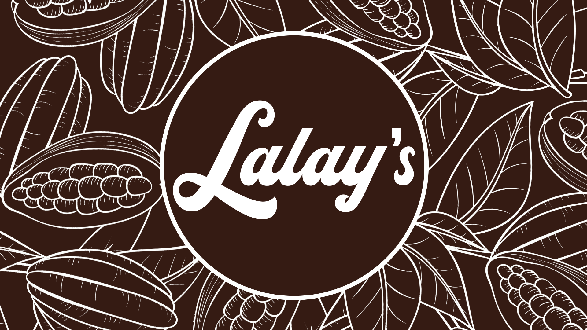
The wordmark logo uses a bold, retro-style script with thick, rounded strokes and dramatic swashes. That big looping “L” with the long tail underneath is the hero. It’s not a delicate calligraphy script—it’s chunky, playful, and confident. Think 1970s diner signage meets modern dessert shop.
You can’t get more on-brand for a baker known for chocolate ganache with a deep chocolate brown background. The palette directly mirrors her signature product: rich cacao base, glossy ganache top. In the banner version, the white line-art cacao pods and leaves reinforce that “bean-to-cake” chocolate narrative.
The script feels handwritten but polished. It has that “made with love” vibe without looking amateur. The weight of the letters makes it feel indulgent and rich, like the dream cake itself. It’s elegant, classy, yet friendly and warm. It’s a signature logo that would definitely stand the test of time.