RCJ at 50
THE BRIEF
The Rogationists in the Philippines are celebrating their 50th year of presence in the country. As part of the three-year preparation for the 50th anniversary of the foundation of the Rogationist Congregation in the Philippines and in Asia in 2026, the Saint Matthew Province has launched a contest for the logo (“Logo para sa Jubeleo”) for this historic event. The inspiring theme of the Golden Jubilee Year is “Grace upon Grace” based on the Gospel of John, 1:16. This event logo project was an entry to the logo design contest.
THE SOLUTION
Allow us to quote the full set of verses from which the theme “Grace upon Grace” was taken from in the bible:
“The true light, which enlightens everyone, was coming into the world.
He was in the world, and the world came into being through him, yet the world did not know him. He came to what was his own, and his own people did not accept him. But to all who received him, who believed in his name, he gave power to become children of God, who were born, not of blood or of the will of the flesh or of the will of man, but of God.
And the Word became flesh and lived among us, and we have seen his glory, the glory as of a father’s only son, full of grace and truth. (John testified to him and cried out, “This was he of whom I said, ‘He who comes after me ranks ahead of me because he was before me.’ ”) From his fullness we have all received, grace upon grace.
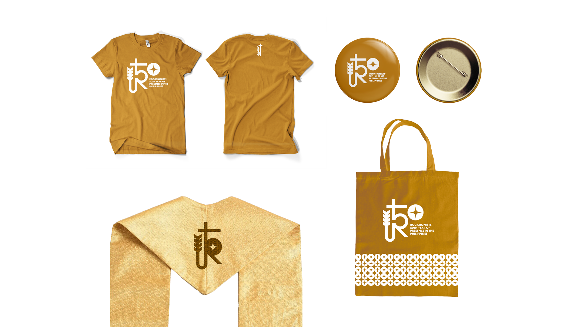
Inspired by the “true light,” a beautifully minimalist 50th anniversary logo for the Rogationists of the Heart of Jesus in the Philippines was submitted for the competition. Below is a breakdown of the visual elements that reflected the Rogationist charism.
THE COLOR
Set in gold and white, the colors of the logo perfectly encapsulates the theme of the Golden Jubilee Celebration of the Rogationists’s 50th year of presence in the Philippines.
Gold reflects the 50 golden years of the Congregation in the Philippines as it celebrates the vocations offered to the Church, the communities it was able to build, and the legacies it has made.
White symbolizes the call for conversion, renewal, and holiness to prepare the Province of St. Matthew, together with its benefactors and friends, to be spiritually ready for this great occasion.
THE ROGATE CROSS
The Rogate Cross is reimagined in this logo. The elements of the cross which include the letter ‘R’ of the Rogate and the stalk of wheat, which represents the Harvest, were streamlined for a minimalist design. The combination of these elements were made to create the number 5 shape.
THE SPARKLE
Beside the Rogate Cross is the round shape that completes the number fifty (50). Inside the circle is the sparkle which represents the light from which grace upon grace is received. It also reminds us of Mary—who is full of grace, the Mother of Evangelical Rogation. Through the Blessed Mother’s intercessions these graces and blessings were also obtained.
It was an honor creating a logo entry for the 50th year anniversary of the Rogationists in the Philippines. While another logo was chosen for the event, we are grateful for the opportunity of participating in the historic event.
Testimonial