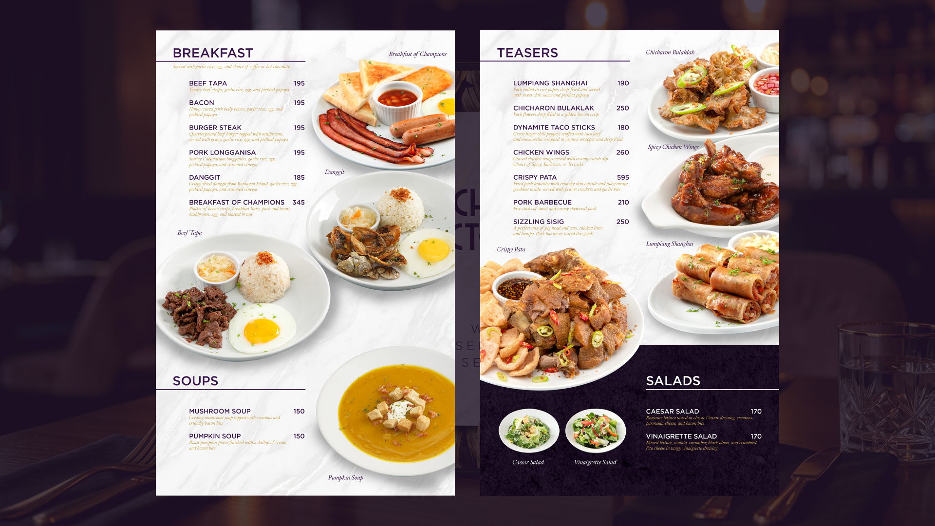
Chef Victoria is the food and beverage brand of motorist hotel with a 5-star hotel quality, Victoria Court. The new menu features Filipino classics with a twist cooked with farm-to-table ingredients. They needed a luxurious yet classic design that also serves sexiness and sophistication.
The cover features golden foliage used to visually communicate the farm-to-table concept and the luxe vibe of Victoria Court. It directly ties to Victoria Court’s 5-star positioning while signaling fresh, ingredient-driven cuisine from local farms. Textures of gilded marble and purple velvet were used throughout the publication that signal luxury, elegance and style.
Aside from the Art Deco font of the brand, the menu also uses a clean typography of modern sans serif for headers. For the dish descriptions, an italiced serif font in gold was used.
The photos were shot on a 45° angle, dishes are served on white plates with natural lighting. Food styling is clean but indulgent. Filipino comfort food is shot like fine dining.
Overall, the design embodies Victoria Court’s signature blend of indulgence and refinement. Deep purple headers and gold italic descriptions guide the eye, while large-scale food photography gives Filipino classics a fine-dining treatment. The design translates farm-to-table sourcing into visual language: organic gold botanicals, natural stone textures, and regal purple accents deliver 5-star hotel luxury with a distinctly local, ingredient-driven soul.