PHDeli Corp is attending WOFEX (World Food Expo) for the first time as an exhibitor, they needed a catalogue that will showcase their products. With lots of other exhibitors in the expo, they needed to stand out and make a lasting impression.
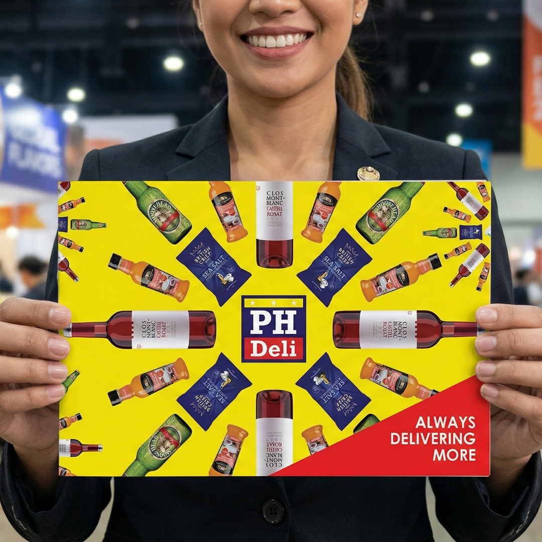
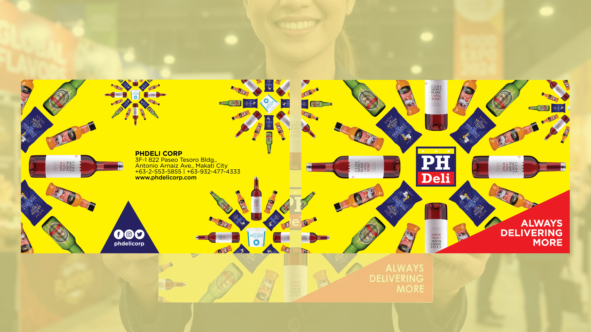
We created a catalogue design with the theme “An explosion of flavors at PHDeli.” It literally feels like the products burst off the page. The front cover is pure energy. Against a high-impact yellow backdrop, PHDeli’s wines, beers, sauces, and chips radiate outward from the central PH Deli logo like a firework frozen mid-burst. It gives you the sense that PHDeli isn’t just carrying products, it’s launching them to the Philippine market as the exclusive distributor of the featured brands.
The electric yellow screams attention in a crowded expo hall. It’s bright, optimistic, and makes every product label pop. The red corner slice bears the tagline of PHDeli, “ALWAYS DELIVERING MORE.” It acts like the spark that set off the explosion.
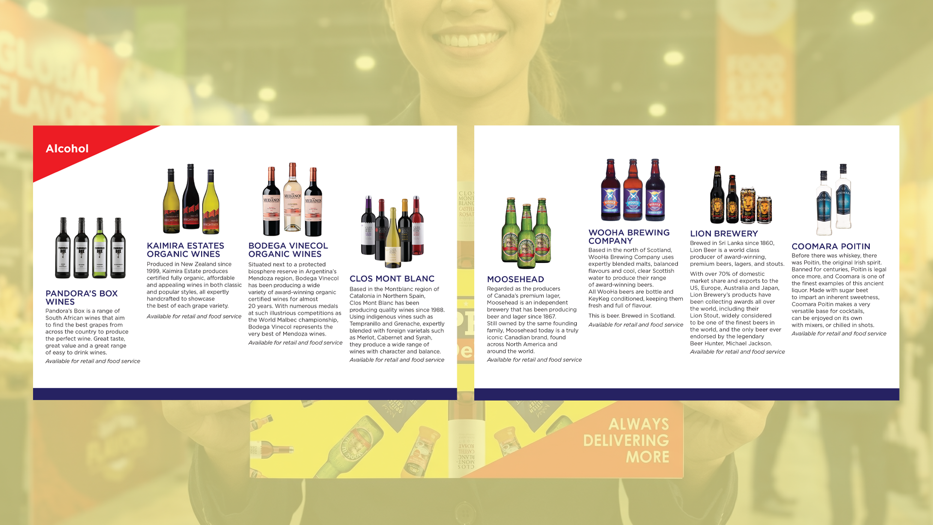
Open it up and the explosion becomes organized. The clean white background takes over so buyers can actually read the catalogue. The choice for the size of the brochure was also strategic.
With other brands opting for bigger and thicker marketing materials and portfolios, we made the PHDeli catalogue handy so the future customers and buyers will be able to bring them home.
Overall, the design doesn’t just show products. It performs the brand promise. “An explosion of flavors” isn’t a tagline here—it’s the entire visual language. For a first-time exhibitor, this is how you make sure nobody walks past your booth without remembering you.